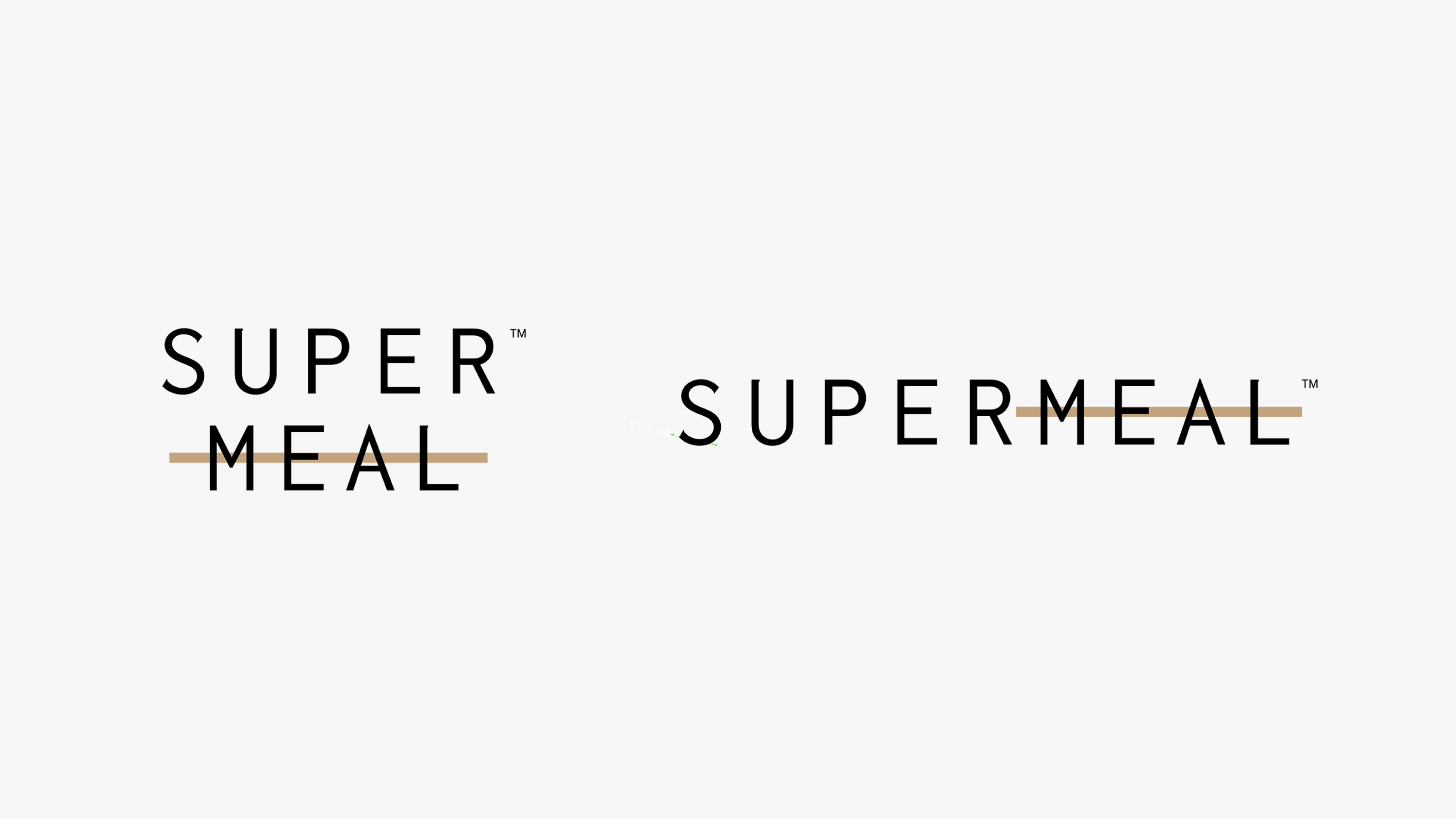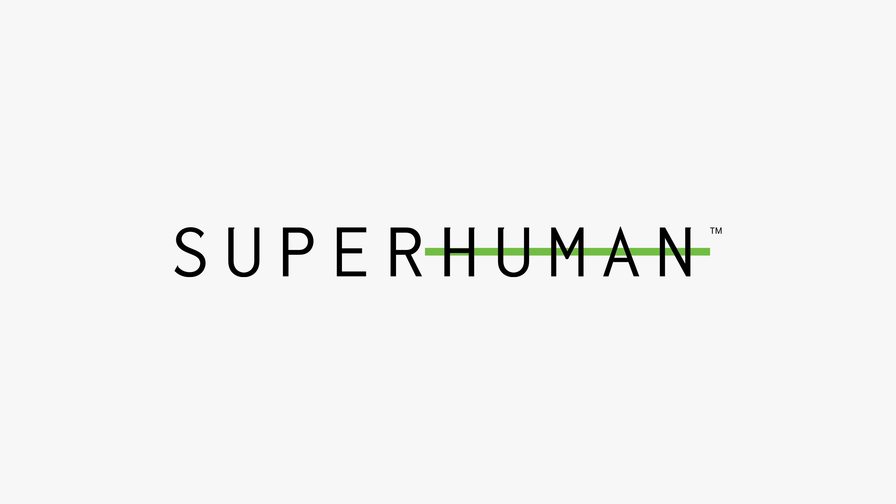
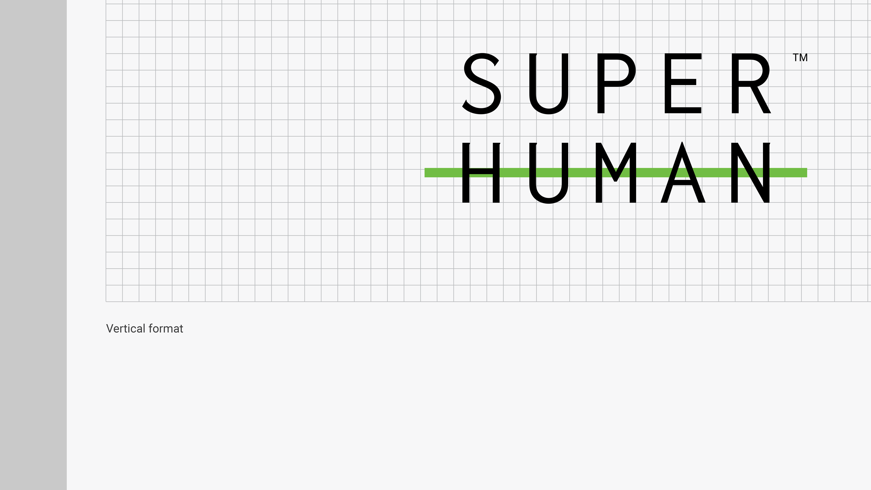
The brand name is conceived as a counterpoint to the conventional idea of being “human,” expressed visually through a bold typographic strikethrough of the word Human. This treatment reflects the brand’s ethos: elevating physical performance beyond natural limits through scientifically formulated products and natural ingredients.
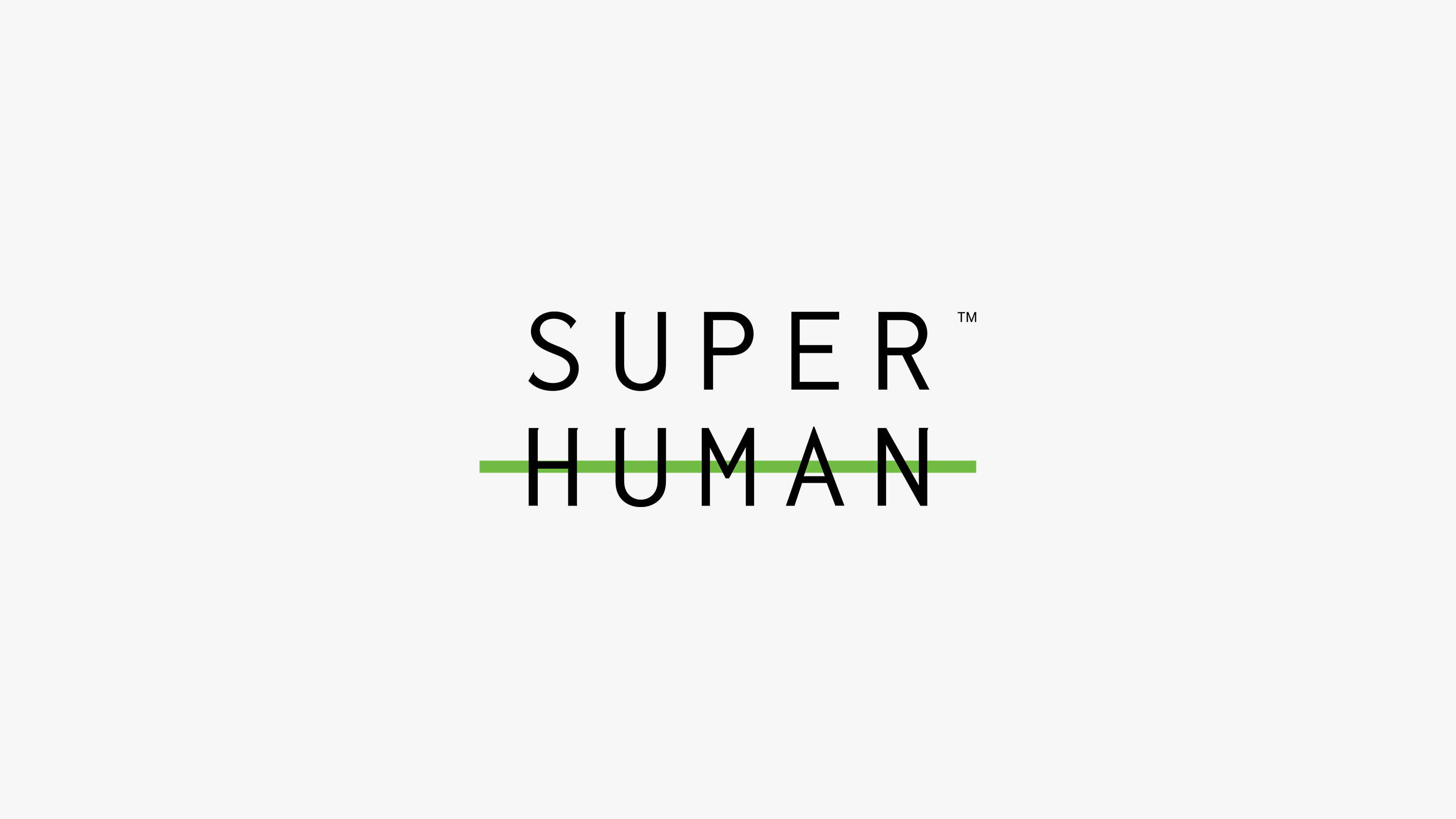

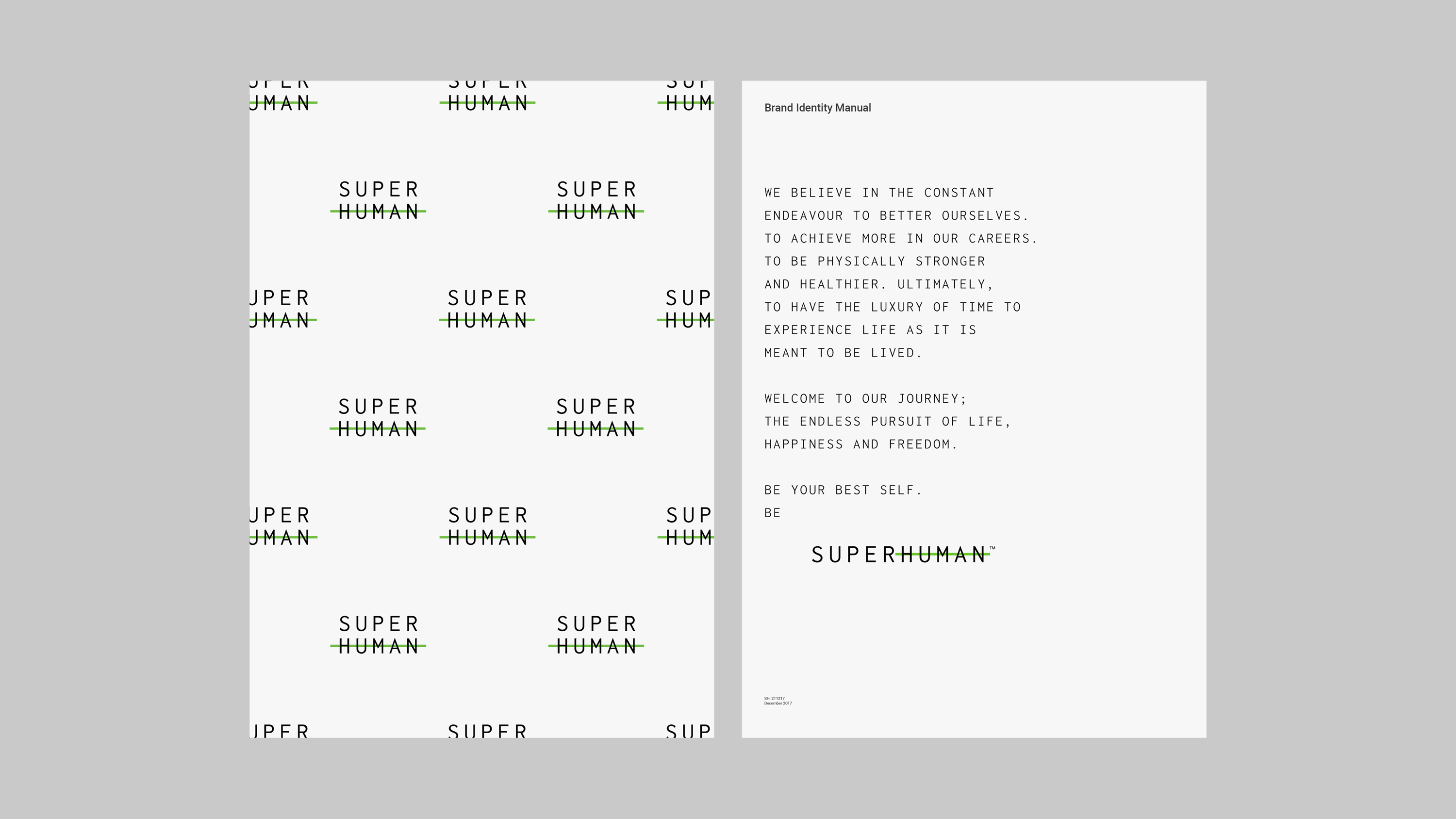

This typographic gesture anchors the entire visual identity, providing a flexible yet consistent framework that extends seamlessly across sub-brands and product lines—ensuring clarity, cohesion, and distinctiveness throughout the brand ecosystem.